
When looking at some of the new, very bold, modern and colourful metro stations that are popping up in so many cities around the globe, the days of grimy tiled walls that lead through narrow tunnels towards bleak and dark platforms seem far away. Today, there are city councils and metro operators that openly promote arts, good architecture and interior design in their metro stations, making the daily commute a delightful, inspiring and sometimes thought-provoking journey.
The various examples range from metro systems that are designed to have a passenger-friendly and striking architecture, such as the ones in Bilbao, Spain, and in Washington, US, to subways with a standardised design but distinct interior stations, such as in Munich in Germany and in the Czech capital, Prague.
Elsewhere, architects have designed single metro lines with unique and distinctive stations, such as the Jubilee Line extension in London, UK, and the Tokyo Oedo Line in Japan. The most spectacular metros can however be found in former socialist countries, for instance in Moscow with its legendary Kievskaya station. There, the stations were originally designed as ‘palaces’ for people, often designed with the use of valuable materials.
In Brussels, Belgium, and Stockholm, Sweden, with its unique Tunnelbana station, on the other hand, metro stations are designed around collections of public art.
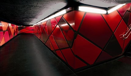
One of the most iconic and unique stations of recent years is Barcelona’s Drassanes station in Spain, designed by local architectural firm ON-A arquitectura and officially opened by Transports Metropolitans de Barcelona in 2009. The company’s founding partner and architect Eduardo Gutiérrez was involved in the project from its earliest design stages up until its actual construction, assisted by an array of architects and interior designers including his partner Jordi Fernández. Here, he reflects on the difficulties of designing a futurist and memorable, yet functional, metro station which gives passengers the feeling of being at home in transit.
How well do you really know your competitors?
Access the most comprehensive Company Profiles on the market, powered by GlobalData. Save hours of research. Gain competitive edge.

Thank you!
Your download email will arrive shortly
Not ready to buy yet? Download a free sample
We are confident about the unique quality of our Company Profiles. However, we want you to make the most beneficial decision for your business, so we offer a free sample that you can download by submitting the below form
By GlobalDataElisabeth Fischer: As an architect, what were your reasons to become involved in the redesign of Drassanes station in Barcelona?
Eduardo Gutiérrez: As architects, we are interested in being able to design all kinds of spaces. Apart from that, a metro station has some very demanding requirements of functionality and safety, which was a challenge for us. In order to get assigned to the project we took part in a restricted competition for Transports Metropolitans de Barcelona, which we eventually won.
EF: What inspired you for the final subway station design?
EG: Our inspiration came while we were trying to give the maximum of light to an underground space that doesn’t have any natural light, in addition to solving all the problems of communication flows and those that previously existed.
Each metro station has different elements of facilities, signage and security systems that confuse the user’s visual space.
Our goal was to minimise all these elements in order to support the daily operation of the station. We also generated a geometry that avoids the dark and right angles to give more flow to the passage of people.
Drassanes is a station that is more than 40 years old, so our project was based on a comprehensive rehabilitation of the interior space, which included the exchange of materials and facilities throughout the space.
EF: What materials did you use for creating the interiors of the station?
EG: Drassanes is one of the few stations where the hallways and sidewalks are at the same height. We took advantage of this and looked for the continuity of space. Therefore we used one single skin that allowed us to solve the heterogeneity of the station prior the renovation. That’s why we mainly used glass reinforced concrete (GRC), as it allowed us to create a continuous and adaptable system to the different station elements.
Another reason for using GRC was that we needed a material that is highly resistant to the daily passage of people and that in turn could be moulded and prefabricated in order to solve all the problems that arose in the geometry of the existing station. We also used a continuous terrazzo floor for the station, which facilitated the curved shapes of the pieces of GRC in favour of a more continuous space free of joints.
For the connecting tunnel underneath the two tracks, the GRC could not be applied due to the limited space. So we used a steel plate coated with different forms and with the waterproofing core of MDF.
The finishing details are similar to the interior of a train’s wagon that hosts everything passengers need and provides a clean and bright appearance. If the commuters were comets their trails would weave together along their paths by the station. The lighting and the panels of the connecting tunnel at Drassanes reflect the idea of lives that cross daily.
EF: How did you work around the limitations of constricted space of Drassanes station?
EG: For the halls we chose visual effects in order to give commuters the feeling of more space. We tried to achieve this by creating a backlighting black space that has the shape of a ‘U’, through which people pass, as well as a black roof through which the facilities pass. That way, people don’t realise how close the roof is and get the sensation of more space.
For the platforms we chose to create a white skin in the shape of a ‘C’ so that the light bounces across the surface and therefore gives the sensation of more space.
The most important thing for the movement of people within the station is the signposting – it must be clear and concise so that people do not stand still and create ‘plugs’ in the circulation.
So we put all the signs against a white background, mainly because the signal is black, that way it is displayed quickly.
EF: How does designing the interior of a subway station differ from creating other public spaces?

Each metro station has different elements of facilities, signage and security systems that confuse the user’s visual space.
EG: What differentiates a metro station from other types of projects are basically two things: the people who pass through it every day, in Drassanes we have around 15,000 people daily, as well as the elements of security and communication within the station. Therefore, the choice of form and materials is closely linked to its heavy use.
The design of a station requires taking into account criteria such as the path of the blind, emergency signals and information, fire exits and so on. Also, everything has to be integrated into an architectural concept.
The hardest thing is to think of a construction system that meets all expectations of design and durability and can be made within only four hours of daily work during the night, since the station has to be in use during the day.
EF: What are some of the most iconic metro station designs today?
EG: In the recent years, cities have been opting a lot for a good design of metro stations, so you can find many interesting designs around the world. But something that is not taken into account, but is equally important, are the subway entrances, they are benchmarks in urban planning.
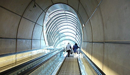
One of the most iconic designs of entries I’ve seen, are the glassy, tubular station entrances to the metro in Bilbao, designed by Norman Foster.
EF: Why have the interiors of metro stations become so important?
EG: To have a pleasant space is always more interesting than the opposite. Previously, underground stations were seen as spaces of second category with the only important thing being its functionality, regardless of the physical and visual comfort of the user.
I think this is no longer true; metro transport has become very significant for today’s cities where thousands of people spend an average of 20 minutes each way every day. Subway and metro stations are the most crowded public spaces of any city. So why shouldn’t we care?


